Razor: Revamping a Brand
A complete redesign and rebuild of Razor’s marketing site, focused on bold visual identity, intuitive UX, and accessible, motion-rich interactions.
Project Overview
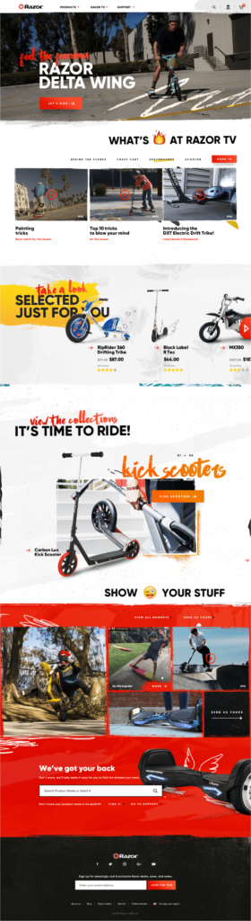
Razor partnered with me to completely redesign and redevelop its marketing website, transforming it from a flat, forgettable experience into a bold, high-energy digital presence with real street cred. The goal was to modernize the brand, sharpen the messaging, and create an interface that feels as fast and confident as the product itself.
Challenge
The original Razor site suffered from several issues:
- Flat, uninspiring visual design that didn’t reflect the brand’s personality.
- Disorganized layout that made it hard for visitors to understand what Razor does and why it matters.
- Weak sense of hierarchy, with key messages and calls-to-action getting lost on the page.
As a result, the site failed to differentiate Razor from competitors or build trust with visitors.
Objectives
We defined clear objectives for the revamp:
- Give Razor a fresh, energetic visual identity that still feels credible and professional.
- Simplify page structure and navigation so users can quickly understand the offering.
- Use motion and interaction thoughtfully to guide attention and create a sense of momentum.
- Improve clarity of messaging and highlight Razor’s value proposition and social proof.
Approach & Process
My role covered both design and full implementation, from concept to code, with a strong focus on accessibility and inclusive design.
Discovery & Audit
- Reviewed the existing site to identify content gaps, layout issues, UX friction points, and basic accessibility problems such as color contrast, heading structure, and keyboard focus.
- Clarified Razor’s brand traits: bold, confident, modern, and street-smart rather than corporate, while ensuring the experience remained usable for as many people as possible.
Visual Direction
- Developed a color system centered around bold, high-contrast tones that inject energy while meeting accessibility contrast guidelines for core text and UI elements.
- Paired strong typography with generous spacing to create a confident, editorial feel and maintain legibility across devices.
- Established a component-based design system with consistent hover and focus states to support keyboard and assistive technology users.
UX, Layout & Accessibility
- Reorganized content into a clearer narrative: what Razor is, why it matters, how it works, and what to do next.
- Structured pages with semantic HTML and a logical heading hierarchy to improve screen reader navigation.
- Ensured interactive elements are reachable and usable via keyboard, with visible focus styles and meaningful labels on buttons and links.